PM vibe codes a mobile app: When the Cheap Model Won
Mobile App Dev and AI Spikiness

19,582 lines of code in one day. Not a typo—just AI-assisted development at full throttle.
Here’s what surprised me: the cheaper models often wrote better iOS code than the expensive ones.
If you’re a product manager wondering what AI means for your career, you’re not alone. This post (and entire series) is for you to get a glimpse of my experimentations, discoveries, and thoughts while spending 100s of hours using AI-based development tools. The ability to build real products yourself—or at least prototype convincingly—is no longer theoretical. But the learnings aren’t always what you expect.
I was several hours into creating my latest big idea - a mobile app for Prophecystack.ai. It was going to be a sleek, fun, and addictive consumer app. But now I was in the weeds. Suddenly I was staring at a SwiftUI grid layout the frontier model generated: ten lines of unnecessary property wrappers, custom view modifiers, and MVVM abstractions for what should’ve been three lines. I deleted it, asked a cheaper model the same question, and got exactly that: three lines that worked on the first try.
That was the moment I realized something uncomfortable:
Model performance isn’t a smooth curve from cheap → expensive. It’s spiky.

The Numbers That Stop Scrolling
19,582 lines of code committed in a single day (my personal max)
10 days from idea → App Store submission
>100 model switches in a typical day
Hit usage limits multiple times → forced strategy changes mid-build
One Saturday everything clicked. After dinner, the baby was asleep, the house went quiet, and I dropped into pure flow state. By midnight I’d built the basic app layout, core prophecy creation, prophecy management, social follow system, chat UI, and user profiles—AI doing the typing, me doing the steering. By the early hours I was playing with the app. That day became the 19k LOC day.
Now this was a new app, and so a decent percentage of the LOC were basic scaffolding and setup. But I was pushing the AI to see how far I could take it: I had a manic energy about me as the ideas flowed. I was one-shotting massive chunks of functionality where I didn’t feel I was breaking any new ground (e.g. social features), and I was queuing up prompts in the IDE like I never had before. But beyond the 19k figure, most importantly I had a functioning prototype on day 1.
The Contradiction
In my first post and second post, I said: use the best model you can afford. Frontier models. The expensive ones. I was building an enterprise web app and that advice worked beautifully.
Then I tried building a consumer native iOS app using my exact same 10-step vibe-coding methodology.
Same process. Completely different results.
For web backend work (TypeScript, APIs, React), frontier models were monsters—in a good way.
For SwiftUI, they were often… too clever for their own good.
Cheaper models won more than they should have.
And it wasn’t a minor edge case. It changed how I think about model selection entirely:
If you’re blindly using the most expensive model, you might be getting worse results.
By the end of this post, you’ll understand:
When cheaper models beat frontier models (and why)
How to run a multi-model workflow without turning your repo into a crime scene
Why usage limits are the new bottleneck
Why UI work still takes 3× longer than you think
Going Mobile
The enterprise web app was working. Users were creating prophecies (my AI-generated workflows), running them, sharing results. It was built for power users—people who want knobs, switches, and full control over very complex ideas.
Then a friend tried sharing a prophecy with their partner. They forwarded the result email for their “What to wear today” prophecy. Their partner clicked it, saw a beautiful output, and asked:
“How do I get this on my phone?”
That question rewired the whole product direction.
Power users love control. Regular people want outcomes:
on their phone
in a widget
shareable with friends
easy to set up
So I pivoted: consumer iOS app, template-driven creation, social layer, mobile-first delight.
I chose native iOS over cross-platform frameworks for one simple reason: polish. Native apps feel better; animations, gesture behavior, platform integrations (Widgets, Push, Share Sheet), fewer weird “it works in the simulator but not on device” moments.
And with AI writing most of the code, the classic “native is slower” argument gets weaker. The UX benefit stays. The typing cost drops.
What We Built
This wasn’t a demo. It was a real consumer app scope:
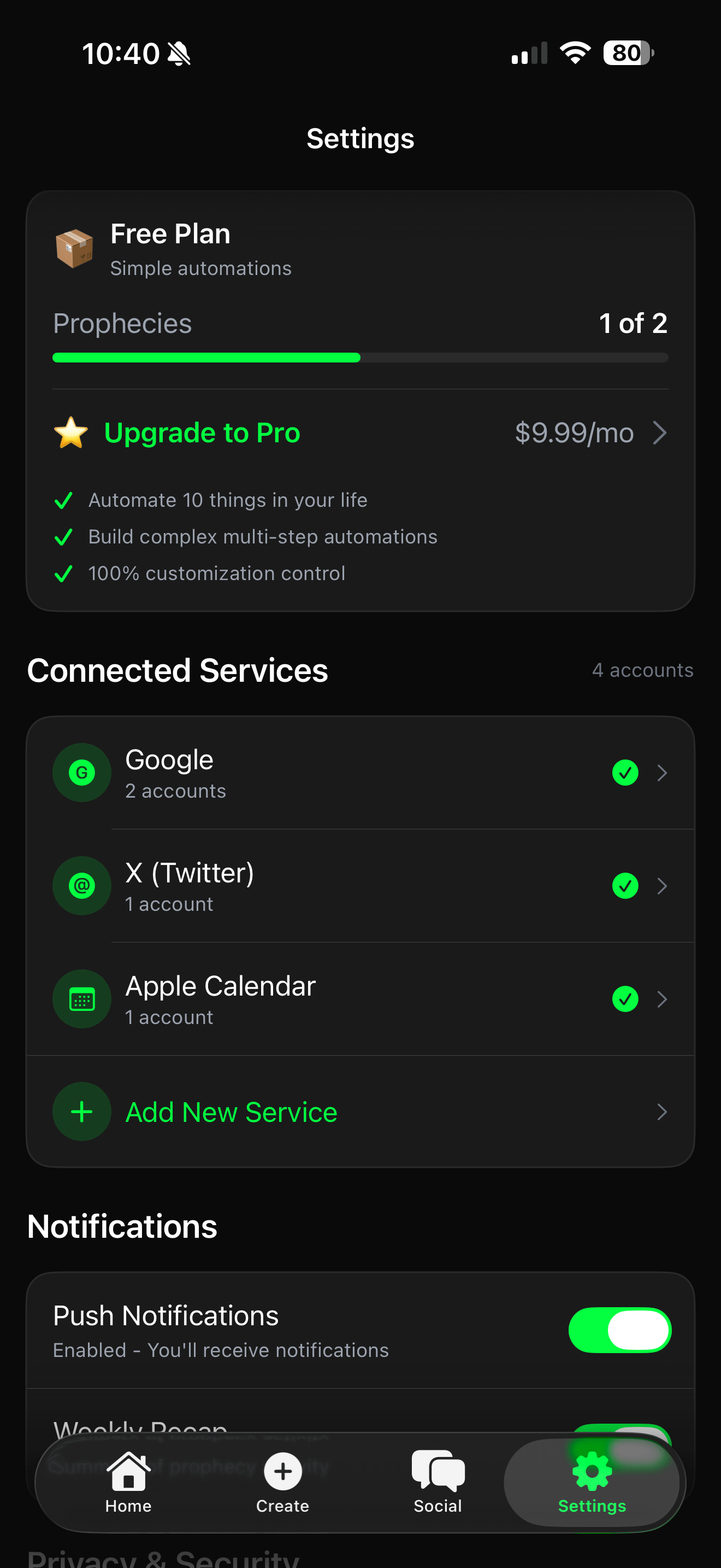
Full auth flow (email + Google, keychain, JWT refresh)
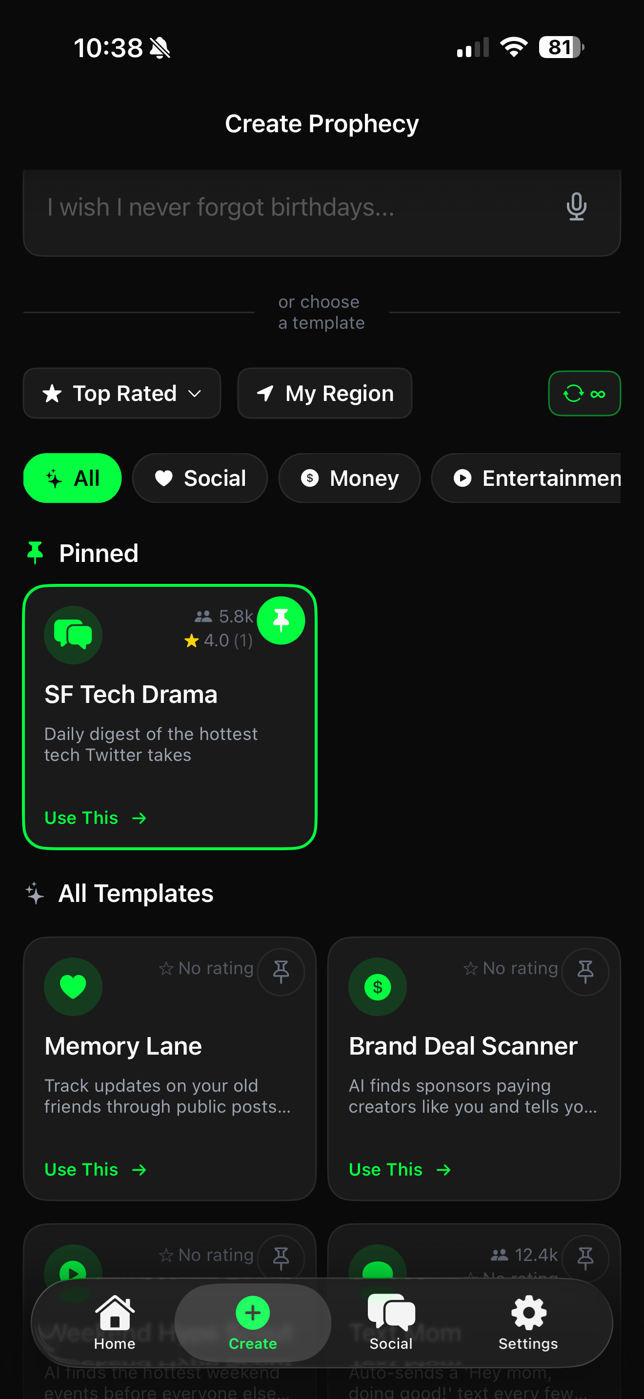
Home feed with templates + discovery
Multiple creation flows (templates, natural language, chat)
Prophecy detail with multiple output styles + run history
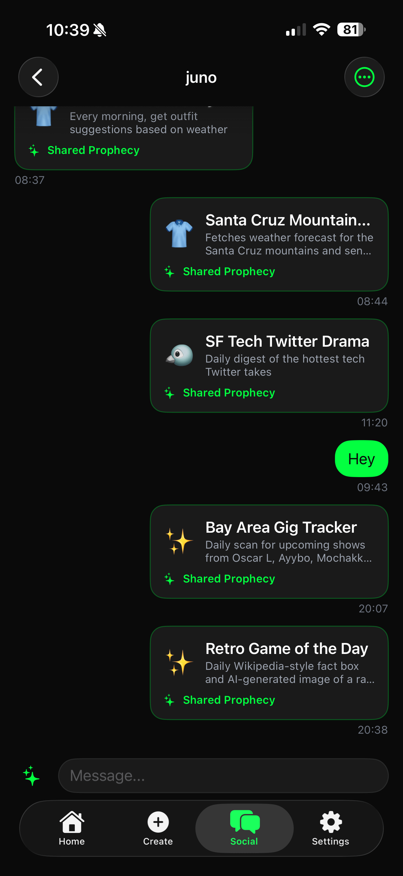
Social: follow feed, DMs, profiles, sharing
Phone Widgets (small/medium/large) with automatic refresh
Native share sheet, social sharing, and shareable card generation
Push notifications, offline caching, deep links
The interesting part wasn’t the feature list, it was where the AI struggled vs. where it surprised me.
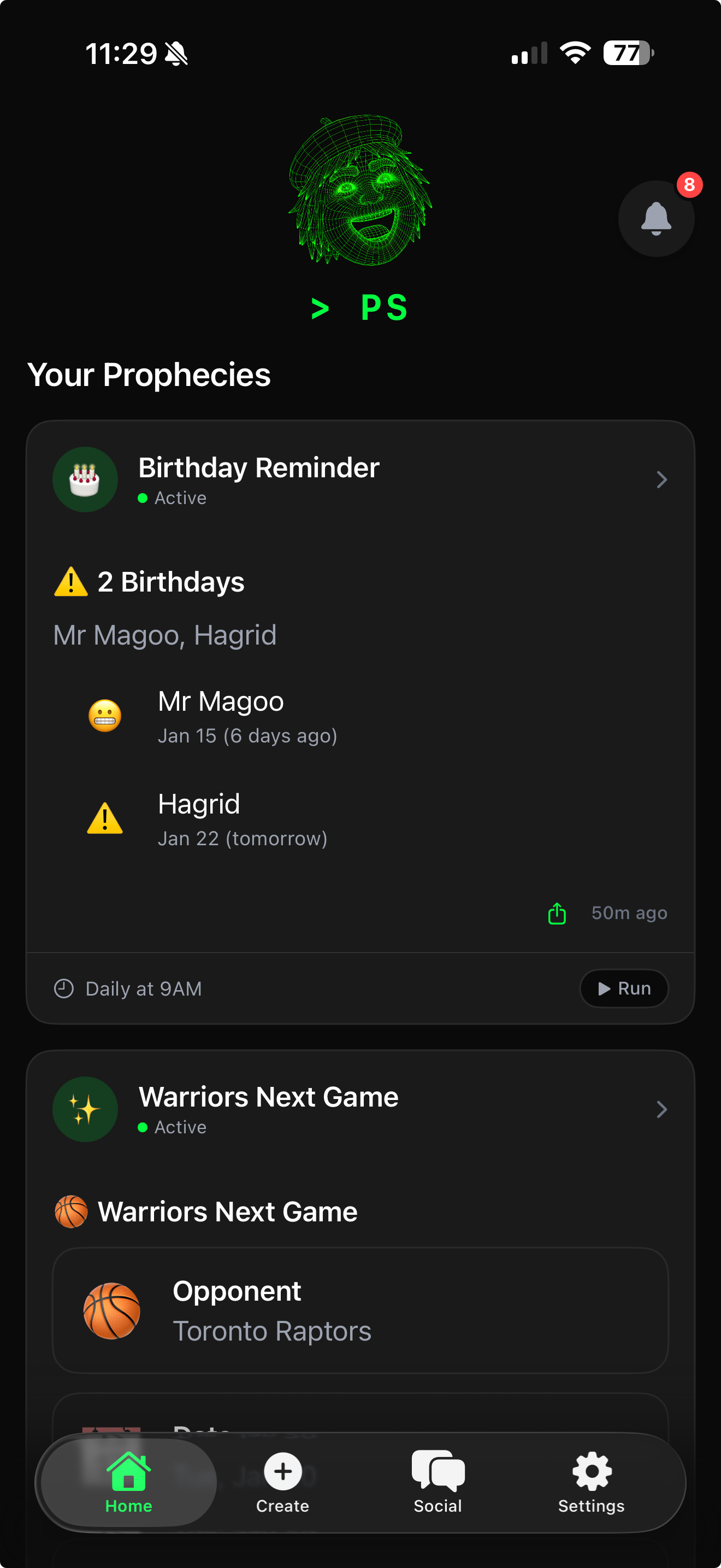
Concrete use case: A great use case for the mobile app (requested by my wife) was to get a set of birthday reminders. The prompt was: “Check my google calendar every day at 9am for upcoming birthdays in the next month, and any that have happened in the past week. Deliver them in the mobile app as a list”.
Voilà! Prophecystack.ai was able to create the prophecy and logic perfectly. I found a bug with the google authentication, but other than that it was a one-shot experience.
The “Cheap Model” Wins (SwiftUI edition)
The output mapping WYSIWYG editor is a perfect example. This was a set of features to make sure any prophecy’s (workflow) output could reliably be mapped to mobile native UI components.
The frontier model generated a whole system:
custom view modifiers
elaborate drag state management
a ViewModel architecture that fought SwiftUI
complexity that didn’t compile cleanly
The cheaper model did what SwiftUI often wants - simple menus.
Same pattern in the chat system.
The frontier model kept trying to architect it like a large-scale app:
protocols for message types
services layered on services
multiple ViewModels that got tangled in state updates
Result: freezes, messages not loading, UI hangs.
I deleted it and asked the cheaper model to build it plainly—views bound to the data models, minimal abstraction.
It worked.
The Discovery: Model Spikiness
I expected: expensive model = best results.
What I got: task-specific spikes.
The pattern repeated across dozens of features:
Ask frontier model for a simple grid → it over-engineers and sometimes doesn’t compile
Ask cheaper model → three lines, first try
Ask frontier model for state handling → protocols and services
Ask cheaper model → “Use
@Stateand move on.”Ask frontier model for API integration → elaborate custom error taxonomies
Ask cheaper model → clean async function, done
Over and over, the frontier model solved the wrong problem. It built an architecture. I needed a working screen.
Why this happens (my working theories)
These are hypotheses, not gospel:
SwiftUI is newer and weirder than it looks.
It’s declarative UI with sharp edges. Models trained heavily on web patterns tend to over-translate React instincts into SwiftUI.Some models are “too smart.”
They assume complexity is a feature. Sometimes the correct solution is a boring three-liner.Training distributions differ.
Cheaper models may have been tuned on practical code examples where simplicity wins.
This spikiness will certainly shrink over time. But right now, you have to test—don’t assume.
The Multi-Model Reality
Here’s what working multi-model actually looked like:
The models I used
Frontier models: backend + API design → consistently excellent
Cheaper models: SwiftUI implementation → often better
The workflow
Two AI coding agent windows open:
left: frontier model doing backend work
right: cheaper model shipping SwiftUI screens
shared repo, separate branches, merge after testing
When it worked
Massive velocity:
iOS screen gets built
backend refactor happens in parallel
merge when both sides pass a sanity check
When it got tangled: shared backend
Mobile drove API changes. Same backend served the web app.
One time I added a field for mobile (previewImageUrl). Mobile worked. Desktop crashed. The desktop code assumed the old response shape.
Lesson: after backend changes, test both apps every time.
Coordination overhead (the real cost)
conflicting patterns suggested by different models
merge conflicts when both touch shared code
context switching resets momentum
I’d explain the architecture to the frontier model, then hop to the cheaper model and have to re-establish context. That overhead is real.
Still worth it.
The Grind
Shipping is always less glamorous than building.
The UI implementation gap (why UI takes 3× longer)
Mocks lie. Real data fights back.
Mock: “Daily Weather Report”
Real: “Your Daily Weather Report for San Francisco, CA on January 17” → wraps badly
Mock: 3 items
Real: empty state, huge state, loading, error → all need handling
The pattern never changes:
UI polish costs time. AI accelerates the first 80%. It doesn’t eliminate the last 20%.
The Honest Reckoning
Usage limits are the new bottleneck
I hit my AI-token usage limits multiple times. Each time, I got forced onto a cheaper (or free) model mid-session. That hit my confidence, velocity, and output quality.
One moment made it visceral: Before I realized that frontier models were not as advantageous for UI code, I was still using them for everything. I was midway through building the chat interface —bubbles working, input styled, about to add “send.” In a single session, I watched my token balance drop by double-digit percentages.
That’s when I switched strategies:
moved implementation work to cheaper models
reserved expensive models for planning + tricky reasoning
stopped wasting frontier tokens debugging SwiftUI over-engineering
The credit conservation strategy that actually worked
Plan → Implement → Review
Plan with the expensive model
architecture decisions
implementation plan
edge cases up front
Implement with the cheaper model
follow the plan precisely
fewer surprises
far cheaper iteration
If you see the cheaper model struggling, give the expensive model a try. It may help.
Review with the expensive model (optional)
quality pass
subtle bug detection
without paying for full implementation cycles
And once I learned SwiftUI was a “cheap-model strength zone,” I often skipped planning entirely and just went straight to the cheaper model.
Conclusion
My biggest takeaways:
Model selection is still task-specific. Price isn’t a reliable predictor. Test.
Multi-model workflows work, but coordination overhead is real.
Shared backends are fragile. Mobile changes can break desktop.
UI still takes 3× longer. Budget for polish. Always.
Usage limits are the new constraint. Tokens are the new bottleneck.
The same pitfalls still exist. AI just helps you hit them faster.
I used to say “always use the best model.”
Now I’m saying: test everything. The cheap model might win—especially in places like SwiftUI where “simple and correct” beats “clever and abstract.”
You’re also probably wondering: what was my productivity boost in this instance? I’d say at least 10x, but less than 100x. This was due to the model idiosyncrasies, credit rationing, and testing overhead that was not really automated. Still, very impressive!
What This Means for Product Managers
Here’s the honest shift:
You can prototype real products now. Not toy demos—actual working flows.
The bottleneck is moving from “can we build it?” to “should we build it?”
Your leverage increases when you can explore ideas without waiting for a full engineering cycle.
Your judgment matters even more, because execution got cheaper.
AI doesn’t replace product thinking.
It just turns product thinking into shipped software faster.
What’s next:
Post 4: CLI as the Vibe Coder’s Tool
Post 5: Genie Apps (Generative Applications)